Customize Linkify Application
Introduction
You can customize how the generated links and the widgets look like. All ready to match your own applications’ design themes.
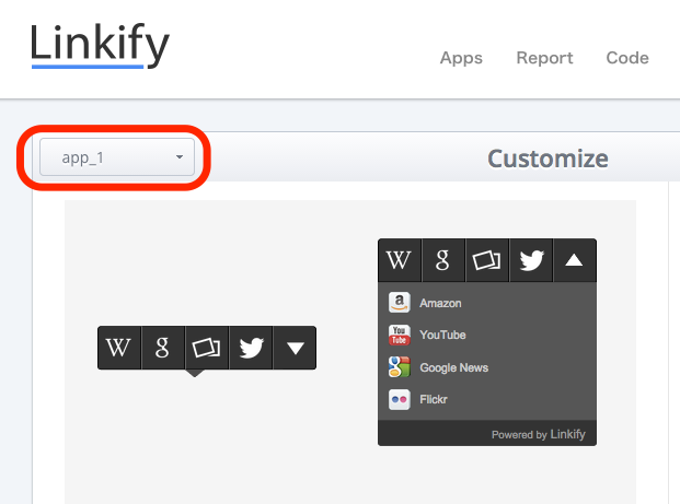
Select an Application
First of all, please select the target application you want to customize. You can select the application from the drop down menu on upper left corner of the customize page.
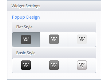
Customize Widget Settings
You can customize your widget’s popup design depending on your taste. Popup design can be chosen 3 types from both Flat Design and Basic Design. Click and check how it looks like in the preview screen on the left hand side.
Customize Link Settings
Click Link Settings tab and you can start customizing the line settings. Customizable settings are Line Type, Line Weight and Line Color. Appearance of each settings can be checked in the preview screen on the left hand side.
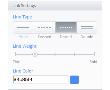
Customize Line Type
You can choose 4 types of underline. Click the best line type that suites your application.
- Solid
- Dashed
- Dotted
- Double
Customize Line Weight
Line weight can be adjusted in 5 stage. Click the stage or Drag the marker in order to customize your line weight.
Customize Line Color
To customize Line Color click the textbox or color icon next to it. You can select the color of your choice by managing the colorpicker or inserting hexadecimal color value into the textbox.
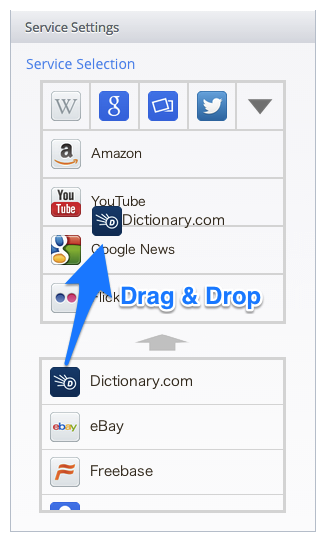
Customize Widget Service
Click the Service Settings tab to customize your widget service. Services displayed in Linkify widget can be customized. To exchange the service, drag and drop the service from the list below to the upper pallet.
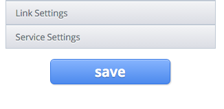
Save Settings
Click the blue save button and the customization is finished. Please notice that the settings will not be saved unless this save button is clikced.
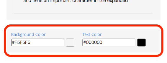
Preview Settings
It might be hard to imagine how Linkify widget looks like in your webstites or applications. You can change preview screen’s background color and text color. Use the colorpicker below the preview screen and check the appearance.